



A blue PPE sign, a yellow bollard and a green floor line communicate in different ways. This guide explains the standard meanings of workplace safety sign colours, how colours are used on barriers and floor markings, and what to check when reviewing your site. Whether you are planning a new layout or refreshing existing markings, start with the message people need to understand. Whether you are setting up from scratch or auditing what you already have, you will find clear, practical guidance in every section below.
Safety sign colours at a glance: what red, yellow, blue and green mean
On standard safety signs, colour works with shape and symbols to communicate the message. Four main colours serve five sign categories:
|
Sign category |
Recognisable appearance |
Typical message |
|
Prohibition |
Red circular border and diagonal bar, black symbol on white |
No smoking; no pedestrian access |
|
Warning |
Yellow triangle with black border and symbol |
Forklift trucks; electrical hazard |
|
Mandatory action |
Blue circle with white symbol |
Wear eye protection; use this pedestrian route |
|
Emergency escape or first aid |
Green square or rectangle with white symbol |
Emergency exit; first aid |
|
Fire equipment |
Red square or rectangle with white symbol |
Fire extinguisher; fire alarm call point |
None of this is arbitrary. Safety sign colours are standardised across UK workplaces precisely because instant recognition matters. Under pressure, in poor light, or for a worker who is new to site or doesn't share a common language, a consistent colour system can make the difference between a quick, correct response and a costly hesitation.
Barrier colours and floor markings can reinforce safety messages, but a coloured barrier does not automatically carry the same instruction as a safety sign. A yellow barrier may highlight a boundary, while a blue sign explains the PPE required beyond it. Use suitable signs, markings and staff briefings together so people understand the hazard, restriction or route.
Getting the colours right is not a minor detail. Mixed or inconsistent colour coding creates confusion, and confusion on a busy site is exactly where accidents happen. It also risks putting you on the wrong side of your workplace safety obligations, which is the last thing anyone needs.
The sections below cover each colour in detail, with practical guidance on choosing and auditing your setup.
How the UK rules and sign standards fit together
Workplace safety signs have legal requirements, while standards help provide familiar designs. Site colour schemes can support these messages, but should not be confused with the requirements for safety signs and markings.
|
Framework |
What it covers |
|
Health and Safety (Safety Signs and Signals) Regulations 1996 |
Legal requirements for workplace safety signs and signals in Great Britain. Northern Ireland has separate corresponding regulations. |
|
BS EN ISO 7010 |
Registered safety signs using standardised symbols, shapes and colours. |
|
ISO 3864 series |
Design principles for safety signs and safety markings. |
|
Site-specific colour schemes |
Additional conventions for routes, storage and working areas, used alongside applicable safety-sign and marking requirements. |
The regulations also cover certain safety markings, including markings for obstacles, dangerous locations and vehicle traffic routes. Where vehicle routes need marking, the requirements specify clearly visible continuous lines, preferably white or yellow, taking the floor colour into account.
Other floor colours may form part of a site's own system, but that system must not confuse required safety messages. Explain the scheme to employees, contractors and visitors rather than assuming everyone already knows it.
Safety signs support other precautions. They do not replace removing hazards, suitable guarding, pedestrian separation or safe working arrangements.
If you are reviewing your layout, explore our tapes, floor paints, warning signs and related products, checking suitability for the surface, location and intended use.
Red: prohibition, danger and fire safety
Red is one of the clearest safety sign colours used at work. In most UK settings, it points to one of three things: prohibition, danger, or fire safety equipment. If the message is mixed, people can hesitate, and that is the last thing you want near a hazard.
You will usually see red on:
-
Prohibition signs such as no entry, no smoking and do not operate
-
Fire equipment signs for extinguishers, hose reels and alarm call points
-
Emergency stop controls on machinery and equipment
Check the complete sign: A prohibition sign uses a red circular border and diagonal bar, while a fire-equipment sign uses a red square or rectangular background. The shape and symbol explain which message applies; red alone is not enough.
Red-and-white temporary barriers can help make a cordoned area conspicuous. Add suitable signs explaining the hazard or access restriction, and choose a barrier appropriate to the location and the protection required.
For maintenance areas and temporary access restrictions, compare our red-and-white temporary site barriers. Check the opening width, stability, storage requirements and suitability for indoor or outdoor use. A lightweight cordon should not be relied on to stop vehicles or prevent falls.Yellow: warning, hazard control and high-visibility protection
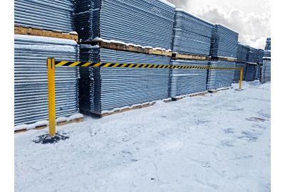
Yellow is used on standard warning signs to draw attention to hazards. These signs combine a yellow triangular background with a black border and symbol. Yellow-and-black finishes also help make many workplace barriers, bollards and protectors conspicuous, although visibility and physical protection are separate considerations.
Common applications include:
-
High-visibility bollards. Yellow-and-black bollards can make exposed doorways, equipment and boundaries easier to recognise. Compare our heavy-duty hi-vis bollards, checking dimensions, fixings and documented performance against the intended application. Colour and diameter alone do not establish vehicle-impact protection.
-
Racking and column protection. Upright protectors, column protectors and racking-end guards protect different parts of the workplace. Choose products suited to the structure, expected vehicle contact and installation conditions.
-
Temporary hazard marking. Yellow-and-black warning tape can highlight a hazard alongside suitable access controls. Deal with spillages and other removable hazards promptly rather than relying on tape to warn people.
-
Steps, edges and fixed obstructions. Contrasting hazard markings can make changes in level and obstructions easier to see. Check adhesion, wear resistance and suitability for the surface.
For warning signs, remember: yellow or amber means take care—a hazard is present.
Consistent use helps reinforce the message, supported by suitable signs and staff briefings. Where physical protection is needed, choose the product for the risk as well as its visibility.
Blue and green: mandatory actions, safe routes and where floor markings help most
Blue and green are two of the clearest safety sign colours in the workplace, but they do different jobs.
Blue means a mandatory instruction. In plain English, it tells people what they must do. That could be wearing a hard hat, using a handrail or putting on hi-vis clothing before entering an area.
Green means safety information. You will usually see it on emergency exits, escape routes, first aid points and assembly areas. If blue is about action, green is about safe direction and support.
|
Sign colour |
Meaning |
Common examples
|
|---|---|---|
|
Blue |
Mandatory instruction |
Must wear hard hat, must use handrail, must wear hi-vis vest |
|
Green |
Safety and rescue information |
Emergency exit route, first aid station, assembly point |
Blue = must do. Green = safe way or safe place.
Floor colour schemes may use green for pedestrian areas or other colours to distinguish working zones, but these choices do not replace standard safety signs or applicable traffic-route marking requirements. A green floor line, for example, is not a substitute for an emergency-exit sign.
Apply your site scheme consistently and explain it to everyone using the space. Check that routes remain clear and that markings are visible against the floor under normal working conditions.
Choosing between tape and paint? Consider the floor condition, traffic levels, cleaning regime and how often the layout changes. Check surface preparation, drying or curing requirements and suitability for the location. A floor-marking kit may help with application once you have selected the appropriate layout and marking product.
A simple site checklist for choosing and auditing your safety colours
Use this checklist during a site walk, covering normal working conditions and the routes used by employees, contractors and visitors.
Consistency
Do safety signs use the appropriate colours, shapes and symbols? Is your site-specific floor colour scheme applied consistently and explained to the people using it? Check for conflicting messages rather than focusing only on matching shades.
Visibility
Can signs be seen and understood from the distance at which people need to act? Check lighting, viewing angles, mounting positions and obstructions. For new signs, consider viewing distance and suitability for indoor or outdoor exposure.
Signs and barriers working together
Does each restriction or instruction have suitable signage? A yellow barrier can highlight a boundary while a blue mandatory sign explains the PPE required beyond it. Make sure the instruction is clear before someone enters the area.
Damaged or worn markings
Check for peeling tape, faded paint and markings obscured by dirt or stock. Repair or renew markings that no longer communicate clearly. Before choosing replacements, check whether surface preparation, traffic or cleaning methods contributed to the damage.
Gaps in coverage
Follow the routes a visitor or new starter would take. Check that relevant hazards, restrictions, emergency exits and first-aid facilities are clearly identified, without overcrowding the space with competing signs.
Reviewing your site colours? Compare our temporary barriers, high-visibility bollards and floor-marking products and safety signs. For help choosing physical protection, send our team photographs, dimensions and details of the vehicles and activities nearby.